Wednesday, February 23, 2022

Picking Images


 On shooting day, I took over 700 photos between my phone and the camera I was using. Over the next few days I went through and sorted through the images and started to pull the best from the different locations we visited. I kept the images with the best lighting, poses and angles of the image to ensure I get the best pictures for my magazine.

 For example:

The lighting in the image is to dark. The sun was hidden behind the clouds and both models appear to not be as highlighted as they now blend in with the background without any light.

In this image, the lighting was a little off still and the pose is to off guard. I would prefer to go with a photo that has a bit more structure to it in the magazine. 


I like this a lot more for the magazine. The lighting is a lot brighter and while it still isn’t perfect I can edit it to make it look more naturally bright easier then the other images. In the image they also look a lot for posed then some of the others. It gives the magazine a more editorial look which is what I was hoping for. 


Tuesday, February 15, 2022

Costumes/Props


    Clothing- Usually travel magazines have models wearing a variety of clothing. For the beach they would obviously be in a bathing suit or some kind of beach coverup. The outfit of the model and pose given to them will help to set the tone of the magazine. I have a few color options will help attribute to atmosphere of the magazine as well. The green bathing suit will add some variety of color and make the magazine more lighthearted. If I wanted a more neutral bathing suit and keep the focus on the photo rather than the model, I could use a brown or black bathing suit. I think I will use a mixture of both bright colors and neutral shades throughout the magazine. I will probably use a brown suit for the model on the cover to keep the focus on the image, but through the double spread, I will use colorful ones such as pink or green to help liven it up a bit. 
   Accessories- I plan on including other little accessories such as jewelry with sea glass, anklets and Puravida bracelets on my models. This will help show the attention to detail I have throughout the magazine and help really give off the vibe of a professional company that would normally control the entire wardrobe, makeup and jewelry that every model would wear. I think I will keep it more simple with silver simple jewelry such as the first 3 pictures as opposed to the string pieces in the last two images. It will give off more of a sophisticated feel rather than a child's bracelet. 


    Props- I plan to include a few props if needed to help add some different elements to shake up the pictures. A umbrella for example will break up a picture of just sand and water. The one pictured below is very neutral and will help to keep the focus on the model and location but still add another component. The same neutral colored concept applies for the chair as well. It gives an added prop to help the model pose with, without taking attention entirely away from them. 
The Premium Beach Umbrella - Antique White - Business & Pleasure CoThe Tommy Chair - Antique White - Business & Pleasure Co


Friday, February 11, 2022

Finding a Magazine Color Palette

When trying to find a color palette to use that best matched the vibe of the magazine, I used the website colors.co and generated random color palettes and pulled the ones with different hues of blue first. 

  • This color combination is a variety of blues, almost like an ombre 
  • I really like the color contrast with the darker colors like 545E75 as it could be used almost like a black on top of a lighter blue like A7CCED without completely adding in a new color shade all together 

  • Although I really liked the all blue colors for the magazine, there is something about the warmer colors and how they pop and contrast nicely
  • FF8C42 and FFF275 would stand out a nice amount on the blue I wanted to add some colors into the magazine to break up all the blue

  • Off all the blue shades I've looked at, 62929E is one of my absolute favorites. It is the perfect balance of cool and bright and reminds me a lot of the deep ocean and not a bright basic blue
  • C6C5B9 is really nice as a white substitute against a darker color if I start to use white an excessive amount

  • This set of colors is gorgeous and mix so nicely with one another and remind me of a wave in the ocean which is perfect for the name
  • I am concerned that the colors are almost to dark and will be hard to read longer written material off of 

  • Just like in the second set of colors I like the orange and yellows that popped against the blue, FDCA40 and F79824 stand out really nicely on a shade of bright blue such as 33A1FD

  • FAFAFF and EEF0F2 are nice white color substitutes as well and DADDD8 is a nice light grey I can throw in throughout the passage, potentially as a subheading color


Wednesday, February 9, 2022

Magazine Cover Rough Draft


    Here is a rough draft of what I would like my cover for the magazine to look like. This is not an image I have taken, it is pulled from online. This weekend I will begin taking photos for the magazine, and hopefully get a nice cover image. 

Some elements included on the cover include:
-Issue # in the top left corner
-Price ($15.00) written in top right corner
-"THE WAVE" written in the middle of the page in white  ("the" smaller and vertical)
-Slogan idea of "For the adventurers soul" written below the title
-Column separation lines to add some blocking in at the bottom of the page
-Larger page numbers above the page content title
-Main spread content ideas written in white at the bottom of the page


What I still need to work on for the cover:
- Retake cover image 
- Come up with more clever names for the spread ides
- Brainstorm more slogan ideas
- Figure out models for cover

Friday, February 4, 2022

Magazine Timeline


       This next few weeks on school days I plan to continue to work on my blog posts so that I can hit the 30 post goal by the deadline. The 12th I plan to scout out a few locations to take pictures and figure out what time of day I should visit each location to get the best lighting. The 19-21 since it is a long weekend, I am planning on starting to take my pictures. Since one of my double page spreads is about different locations to visit I am going to need more then one photo session to capture all the different places with good lighting. I also have the following weekend scheduled to wrap up taking pictures and finish any other shots I have to take. Starting March I hope to edit my pictures and finishing composing the articles and the rest of the magazine. 

Thursday, February 3, 2022

Preliminary Research Step 2


In all the cover pages, the main conventions include:
- A white simple title font
- A singular location on the cover
- People enjoying the travel spot
- Spreads in the magazine listed 

  • Title lays on top of the image as opposed to behind it
  • Main story is bolded and the largest to draw the most attention to it
  • Sub stories listed smaller on the side as to not cover to much of the main image
  • Other countries in mini stories are larger then the rest of the title to draw attention 

  • Main story in the center and in a different color to draw attention
  • Blue text contrasts with the traditional white, however it isn't to much of an out of place color to become a distraction to the reader
  • Singular model enjoying the location 
  • Smaller stories lined against the bottom to not distract from the image
  • Large bolded white font to add a pop of color against the blue ocean

  • Large white font pops against blue sky
  • Large expanse 
  • Simple colors that match with one another
  • Basic font gives an entirely simplistic vibe
  • Model shows what readers could look like visiting the location


Wednesday, February 2, 2022

Layout Sketches


    My cover will contain the title "The Wave" at the top of the page in white bolded simplistic font. The white color will contract nicely with the big blown up cover image. The image will contain both a male and female model and a location that is separate from the double page spread. The content in the magazine will be listed at the bottom of the page in a column like format. 


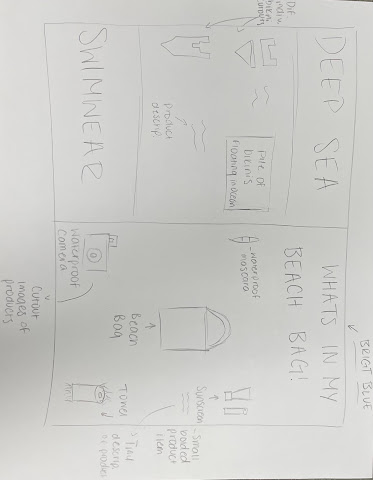
    One of my double page spread ideas is a split page spread with one page being an advertisement for a swimsuit brand and the other page being a what's in my beach bag article. The swim suit advertisement brand name will be "Deep Sea Swimwear" and will contain cutout images of different swimsuit styles and colors with smaller descriptions or an image of a model with handfuls of bikinis. For the what's in my beach bag spread, I will use more cutout images of what would be in a bag with prices for each product and where to find them. 
    Another double page spread idea is the best spots in South Florida to go to. One page will contain a main focus location with the article written in columns and one the other page it will contain the other three locations in smaller image form with little captions as to what's special about each location. 


Final Project

 Below is my final Magazine-