Monday, March 28, 2022

Creative Critical Reflection Question #3

I created an infographic to answer the Creative Critical Reflection Question "How does your product engage with audiences and how would it be distributed as a real media text".


Creative Critical Reflection Question #4

I answered the Creative Critical Reflection question, “How did you integrate technologies- software, hardware, and online- in this project?” using the media kit below.


Creative Critical Reflection Question #2

My response to the question "How did your production skills develop throughout this project?" can be found in the Press link below. 

https://prezi.com/view/hqMeHcsAUiidLk9Z5Zus/


Sunday, March 27, 2022

Creative Critical Reflection Question #1


    The creative critical response question #1- "How does your product use or challenge conventions and how does it represent social groups of issues?" with the google slides presentation down below. 


Wednesday, March 16, 2022

Feedback Focus Group


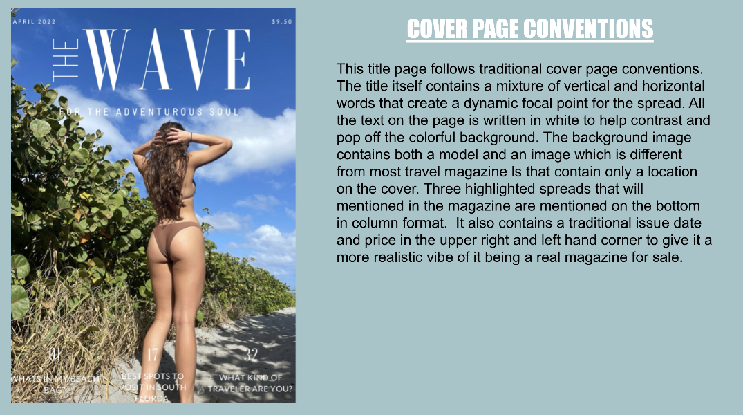
    I asked the people in my class for their opinions on what looks the best out of my options. Out of the table of contents options, they like the background picture of the bridge with the blue background column and white text. They agreed that the white column with black text over the image appeared to harsh on the bright image. 


*This image won second place for the picture of the tree, because if I decide to use the picture of a bridge on my cover they thought the images would look to repetitive*

*This image was liked, but the table of contents contrast against the image was the least favorite*

*This table of contents image was the favorite because of the image and the uniqueness of the content column. The white writing matches the white writing on the cover so it will give the magazine a more cohesive look*


*This cover image was to far back and didn't have the models in focus enough*

*The lighting on the side of the image was to dark*

*This image was liked a lot to but they said they're wasn't enough to look at*

*This is the second most liked one, but they said it looked more like an instagram post. instead of a magazine cover*

*For the cover pages, the one of the bridge received the best feedback because of how the image was really clear and bright and matched the writing style the best.*

Monday, March 14, 2022

Developing Content- Double Page Spread


 For my double page spread, I am going to highlight three different locations in South Florida for people to visit. I am going to include, Key Largo, Jupiter and Deerfield Beach. 

Deerfield Beach Pictures-


Jupiter Pictures-


Key Largo Pictures-


Developing Content- Table of Contents


    I did the same thing as my cover page and made a template for the table of contents so that when I got my images I could quickly just add them in an move on to the next step. For the images I was between a picture of a mangrove and this picture of a bridge. I decided to go with the picture of the bridge because I felt that you couldn’t really tell what the mangrove picture was with the white column covering half of it. 


    The next thing I worked on was the color pallet for this page. I thought the black was a little harsh and a bit out of place since on the cover all my text was white. I came up with two different options for my text colors. The first was a combination of a white background and dark grey/blue subheadings and black text. And the second was a dark grey/blue background with white writing.


    When it came down to text written down on the page, I chose 4 different spreads that I wanted to highlight and I wrote a little description for each one so the reader would be aware of what each one was about.

Page 1- What’s in my beach bag- Take a look into local South Florida celebrity, Abigail Fosters beach bag go-to’st
Page 17- The best spots to visit in South Florida-The most picture worthy and adventure filled spots you have to visit in South Florida
Page 26- Deep Sea Swimwear- A new brand of bikinis that is eco-friendly, affordable and size inclusive 
Page 32- What kind of traveler are you?- Ever wonder what category you would fit into as a traveler? Take this quiz to find out!


Developing Content-Cover Page

    I had already made a template for what I wanted my cover page to look like earlier in the planning stage, so when finalizing it, I copy and pasted different images using Canva to see what it would look like with different photos. This made it a lot easier quicker to work on the magazine, especially since I took my pictures later then I was planning on it. 
These were the pictures I was between for my cover page:


    My original plan was to include both a location and a male and female model on my cover, and in the end I was between these three images:

    I still have to work on fixing up the text so that it doesn't blend so much into the background and adjust the position of some of the wording so it fits the open space of the picture better. I also need to edit the final image I end up choosing to make sure that all the colors pop and it is really clear. Overall I am really happy with the way that these pictures turned out and look with the masthead and think it is a great first page for The Wave magazine. 


Deep Sea Swim


 For one of my secondary coverage pieces I am making an advertisement for a bathing suit company called Deep Sea Swimwear. I shot pictures of different bikinis to put in the advertisement. 
Here is the logo for the brand of bikinis I made:


 I used a few different poses when taking pictures. I took pictures the bathing suits being worn in the water, people “tanning” with the suits on and close ups of cute details on the suits. I still have to edit these photos, these are just the rough picture. 


   I still want to take a picture of a pile of bikinis because I think it’s a basic element used a lot when advertising. Here’s an example:


Final Project

 Below is my final Magazine-